When it comes to Atomic Design systems in Drupal 8, there’s hardly a shortage of solutions to choose from. Pattern Lab and KSS Node are certainly among the most popular and the recently released Mannequin looks incredibly exciting. However, in all these aforementioned solutions, exposing that component data to Drupal has never been particularly straightforward.
Additional PHP libraries like Pattern Lab’s Twig PatternEngine, for example, provide robust systems for integration; however, many of these require a bevy of complex build steps and configuration before you can take advantage of their powerful and extensible integration. Even then, the integration made available in these systems typically ends at the template level. There is very little possibility to interact with or implement components through Drupal’s administrative UI.
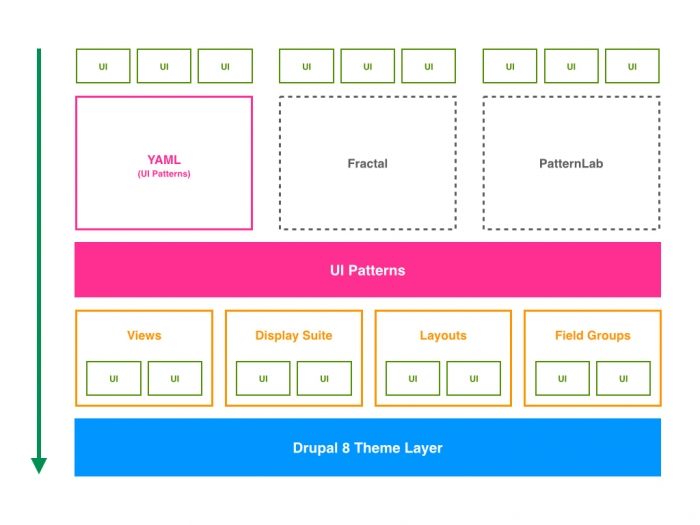
This lack-of-integration issue is what the UI Patterns module looks to solve. While much of the pattern definition is very similar to the other platforms (in fact, you can even import Pattern Lab definitions directly into UI Patterns), when it comes to integrations with Drupal the process is vastly simplified. By providing plugins that make your custom components available in the Drupal administrative UI, UI Patterns tries to simplify and streamline component implementation.
Here at Hook 42, we’ve just finished developing a brand-new Drupal 8 site for a client that utilizes UI Patterns, Paragraphs, and Display Suite to allow content users to construct complex but consistent user interfaces. What follows is our “field notes” from implementing UI Patterns in a production site.
Drupal as a First-Class Citizen:

Installing UI Patterns and getting off the ground couldn’t be easier. Whereas many other component library solutions require some pretty exhaustive setup, UI Patterns is bundled into an easy-to-install Drupal module that enables all of the functionality of the platform right out of the gate.
This is really notable when compared to the installation process for other component systems. Most component systems are intentionally designed to be platform-agnostic. While this is fantastic for developers who work across multiple platforms (Drupal, Wordpress, Jekyll, etc.), it causes a lot of additional work for developers who work in a single platform (like Drupal), to set up all of the “glue” that migrates the components into your platform of choice.
In the case of UI Patterns, however, all that needs to be done is for the module to be installed – no middleman software required, no Gulp or Grunt tasks to run. Independent contributed groups of components, too, can be easily distributed in the form of either a Drupal module or portion of a Drupal theme. For a great example of this in practice, take a look at the Foundation Patterns module, which exposes components from the popular Zurb Foundation CSS framework by way of UI Patterns. Modules like this highlight a lot of the promise UI Patterns has as a platform for developing turnkey contrib component libraries for Drupal. That’s a huge deal!
Defining Patterns:
Similarly, defining a custom component in UI Patterns is incredibly simple. As mentioned above, patterns can be defined either at the theme-level or in a custom module. Regardless of whether the patterns are found in a module or theme, the file structure is the same.
First, the pattern definition is stored in a YAML file named by the schema ‘PATTERNAME.ui_patterns.yml’. An example pattern definition for a card component might look something like this:
card:

    label: Card

    description: A card that contains some content, and optionally an image and a link.

    fields:

        heading:

            type: text

            label: Heading

            description: Card heading.

            preview: A Card Heading.

        body:

            type: text

            label: Body

            description: Card body text.

            preview: This is a great card body – it has a ton of information in it!

        image:

            type: text

            label: Image

            description: The card image.

            preview: http://via.placeholder.com/350x350
Here’s a breakdown of what each of these definitions do, according to the UI Patterns docs:
- ID: The root of a new pattern definition (card in the example above). It must contain only lowercase characters, numbers and underscores (i.e. it should validate against [^a-z0-9_]+).
- label: Pattern label, used on pattern library page.
- description: Pattern description, used on pattern library page.
- fields: Hash defining the pattern fields. Each field must have the following properties defined below.
- type: Field type, can be text, numeric, etc. at the moment only used for documentation purposes.
- label: Field label, used on pattern library page.
- description: Field description, used on pattern library page.
- preview: Preview content, used on pattern library page. It can be either a string or a Drupal render array, in which case we can use keys like type: processed_text or theme: image.
Each pattern definition has a companion template, called pattern-PATTERNNAME.html.twig. A sample template is included below:
<div class="card">

{% if heading %}

    <h2>{{heading}}</h2>

{% endif %}

{% if body %}

    {{body}}

{% endif %}

{% if image %}

    <img src="{{image}}" />

{% endif %}

</div>
Variety of Integrations:

One of the most unique features that UI Patterns brings to the table is a multitude of core and contrib module integrations. Out of the gate there are four sub-modules for integration with Layout Discovery, Display Suite field formatters and layouts, Field Group, and Views.
As you might expect, these modules expose your component library to various display management and aggregation modules. For example, once the “UI Patterns Layouts” submodule has been enabled, it becomes dead simple to make your “Article” content type use a “Card” any place the “Teaser” view mode is used.
An unexpected advantage of this tight integration with Drupal is that it makes it feasible for a developer to expose a set of patterns to a site builder and then allow the site builder to do their own work linking the content types and the patterns. Considering that most other solutions require a developer to dig into the codebase every single time a component needs to be implemented in a different location, this is a huge feature. On that front, UI Patterns definitely provides a lot more autonomy for site builders to apply patterns without calling on the assistance of a developer to link the content type and component together manually.
However, it’s worth noting, that there is an option to use your patterns at the template level rather than using them with Display Suite, Layouts, Field Group, or any of the other supported integrations. This method is somewhat buried in the official documentation, listed under the “developer documentation” section. It would seem that most of the documentation tries to guide users toward the Drupal UI methods for integrating patterns into a site. Rendering a component at the template level is also quite easy. UI Patterns exposes a {{ pattern() }} twig function, which takes two arguments: 1) the pattern name, and 2) an array of key/value pairs for any variables passed into that pattern. For example, {{ pattern('button', {title: 'Link title', url: 'http://example.com'}) }} would render a button element with a custom link title text and URL.
Configuration or Code?

While our experience with UI Patterns led us to really appreciate the convenience of deep integrations with the Drupal administrative interface, there are also some downsides of that design decision.
The encouraged, standard method (according to the UI Patterns docs) for integrating components is by way of in the admin interface – changes that will ultimately live in configuration. The pattern definitions themselves, however, are all done in the codebase through a combination of YAML files and Twig templates. As mentioned above, having the component integration happen at the configuration-level is a real boon for site builders; but, before long there are some severe limitations on those integrations that can get in the way of seamlessly mapping content to your components.
In one instance, we realized that the some of the fields we had exposed in Display Suite weren’t available when mapping the very same entity type in Views. Similarly, some of the field formatting options that are available in Display Suite aren’t exposed in Views. As a result, we needed to work around those inconsistencies. In many cases, we ended up simply resorting to using the twig function and template logic to call out our components. That meant having a fragmentation in our implementation – some of our components were implemented in code, some in configuration. While the outcome is completely functional and serviceable, switching back and forth from code to configuration can get exhausting.
Furthermore, having the ability to map fields in the Drupal administrative UI tends to encourage doing some amount of data “massaging” at the display level – another kind of fragmentation that can cause problems down the road. For instance, if we have a “Button” component that takes a link, we can adjust the display settings for a “Link” field in Drupal to map the text to whatever variable we assign to the button’s text, and the URL to whatever variable we assign to the button’s URL. If this were being handled in code, those would instead be pulled out of the template variables and mapped into a twig {% include %} block.
Takeaways:
All in all, our experience with UI Patterns was positive. Despite any frustrations we might have had with the fragmentation across all these different implementations (and the limitations of each), UI Patterns offers an amazing amount of flexibility. Most of all, it is incredibly promising for large organizations that need a way to package and distribute component libraries across different Drupal sites to site builders and content administrators who may or may not have access to the codebase of the sites they’re building.
The possibilities for site-builders are really amazing here! That said, for a project of the size and scope we dealt with, we were left wondering if a template-level solution would have been more streamlined. Sure, the convenience of mapping content type fields to component fields in the Drupal UI was slick, but the consistency and control provided by a template-level solution often looked really tempting.
For many smaller and simpler sites, the GUI options would likely provide everything necessary, but for a more complex build, it might be worth keeping all of your component mappings handled in twig templates. Luckily, UI Patterns provides a simple twig function that allows you to make use of your custom components in any of Drupal’s theme hook templates.
If you’re looking for more information about UI Patterns (which we should mention was largely developed by the fine folks at Nuvole), you can take a look at their drupal.org project page, official documentation, and github repo. Also, if you haven’t had a chance yet, I’d highly recommend checking out Antonio De Marco’s talk from DrupalCon Vienna for a live demo of the module’s general functionality.