As Hook 42 makes its way through the galaxy, we’re experiencing an incredible amount of growth, both individually for our team members and as a company as a whole. While we grow, it is important that our brand evolves with us.
It has been seven years since the last time we revisited our image, and we’re excited for the opportunity to realign our appearance with the impact we have in our community. Providing the best first impression of our team that we can.
Don’t panic, we’re still the answer you need for all things tech - we just updated our style. Along with the visual brand refresh comes an re-evaluated set of values and mission statement.
Our Mission
Conquering Difficult Problems
We are on a mission to solve problems that others struggle with. We’re a group of good people with strong community involvement dedicated to building honest client relationships. Our ultimate goal is to always provide the best solution for every problem we face.
Our Values
Be Morally Good
Ethical practices are the first step of being a good Hookster, and building responsibly together grounds our team. Every project is driven by our belief that our impact on those around us, and those using things built by us, shape a better picture of humanity. Good morals are the foundation of better relationships and drive better work, and it is important that we stay true to our beliefs.
Create High Quality Work
We are always putting our best foot forward in everything that we do. We regularly tackle the most challenging and complex problems, and we do it at a high performance level. The ability to continuously produce high quality work is what sets us apart. We give it our all, or we give it nothing, there is no in-between.
Contribute To Community
It is important to us that the community we live and breathe within is fully functioning. Bringing our expertise where we can allows us to continue to strengthen a community we hold dear to our hearts. We contribute to help each other grow and ultimately be more successful. As a whole we can go much further than we can as individuals. That’s why it’s important for us to continue to grow and do so within our community.
Continuous Improvement & Education
We’re an ambitious bunch, which means we’re always striving to be on the forefront of our industry. It is imperative to continue to explore what makes us passionate, and hone in on our skillsets. Doing so allows us to produce effective solutions time and time again.
Be Your Wonderfully Goofy Self
To make sure our work is never static, and our culture is never stale, we place a high importance on individuality. We embrace the strange and recognize that being different is what makes us great.
To drive home the impact of our community efforts, and the incredible talent we have here at Hook 42, we wanted to make sure our visual identity was representative of those things. We spent countless hours iterating and perfecting our new look.
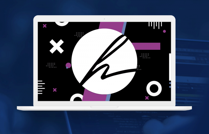
Our New Look
What does our new look mean?
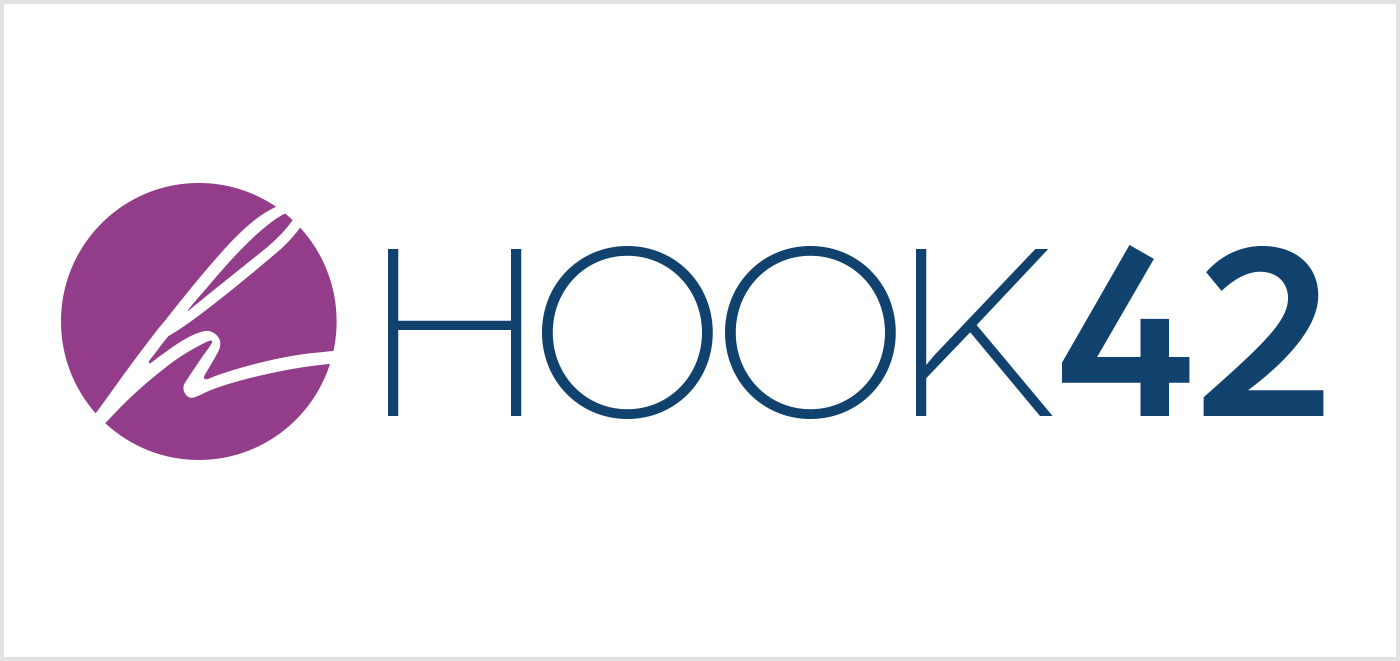
Simply put, we're embracing our heritage while modernizing our appearance. Our new mark inherits the spirit of the previous script style, making the script the center of attention but in the most subtle of ways. The spirit of script is still the heart and soul of the new Hook 42, accompanied by easy-to-read, enhanced typography that sends a clear message.
The simplification of the typography aligns with our focus on the importance of accessibility. A huge motivation behind the change, besides the fact that we were very much ready for an upgrade, was ensuring that our logo passed accessibility compliance on all fronts.
This leads us directly to the color palette enhancements. Our old palette was just not cutting it for color contrast ratios on the web, and we were struggling with our inner demons to promote such an important cause and not be a direct embodiment of it. Now, not only do our colors embody this philosophy, they have been upgraded to help us accomplish another task. Standing out in the crowd. We intentionally chose our colors to go against the industry standard, and fight the stereotypes within the technology industry. Our colors are memorable, so when you see #923e89 out in the crowd, you'll know its us behind the shades.
What's Next
In the coming months we will be redesigning our website, along with updating other methods of communication, both digitally and in print, to reflect our refreshed identity. Bear with us as we continue to update our appearance to be more cohesive across all platforms. In the meantime, we have begun to incorporate our new brand identity, logo and colors to our social media platforms and a temporary face-lift on our website.
We couldn't be more excited to go through this transition and are excited to bring you along with us. So long and thanks for all the fish!